
Product Overview & Problem
Some financial applications are too overwhelming to install after the initial sign-up process.
Most personal finance landing pages either overload visitors with feature lists and financial jargon, or become so minimal that the product value never lands clearly. Neither approach gives users enough confidence to share their financial data. The challenge was not showing everything. It was showing exactly enough.
Solution
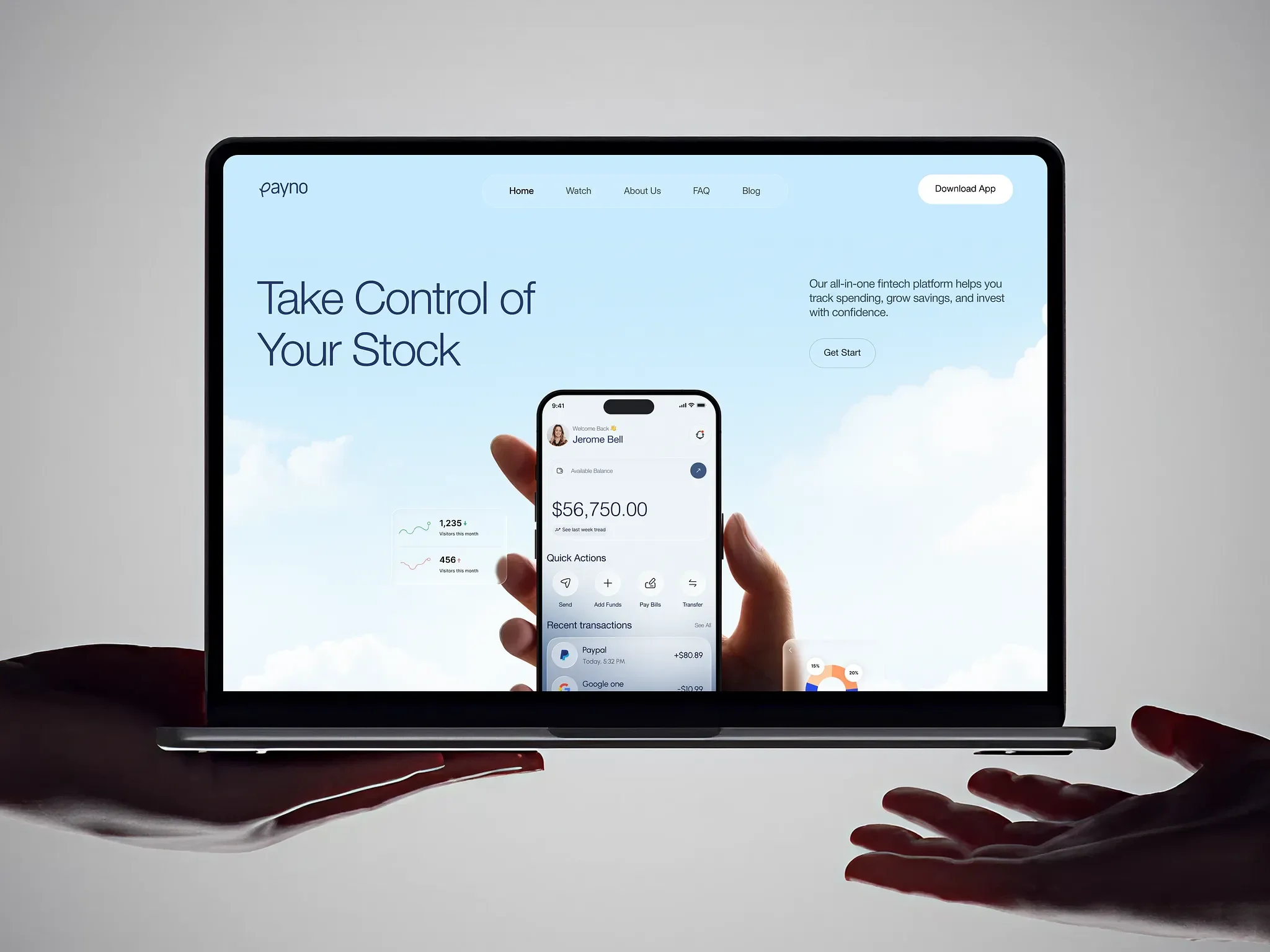
This SaaS landing page design for Payno uses a cloud-white aesthetic, soft sky visuals, and generous whitespace to make every section feel clear instead of crowded. The hero introduces the mobile finance app as the product’s main personality before the features appear.
A four-column feature grid, market analytics preview, earnings screen, and three-tier pricing section build the full product story across one clean scroll without breaking the calm layout system.
Design Focus
The cloud and sky visual language creates a sense of ease around a product category that often feels stressful. Every section supports the same goal: make personal finance feel simple, trustworthy, and approachable.
Feature Highlights
Personal finance SaaS landing page with cloud-white aesthetic and mobile app hero integration
Market analytics, quick exchange, and transaction tracking previews demonstrating product depth mid-page
Earnings screen with real balance figures building product trust before the pricing conversation begins
UI Design

